

Are you going to present a poster for your research? 👨⚕️👩⚕️
Summarizing and presenting research results on a poster is a great way to communicate concepts and data to an audience. With a combination of visuals and text, the viewer can get an overall understanding of the work while you get the opportunity to meet and speak with interesting people.
Regardless of what healthcare profession you have, or what event you are going to participate in, we believe that you can get some useful tips on poster appearance from the text below. 🎨
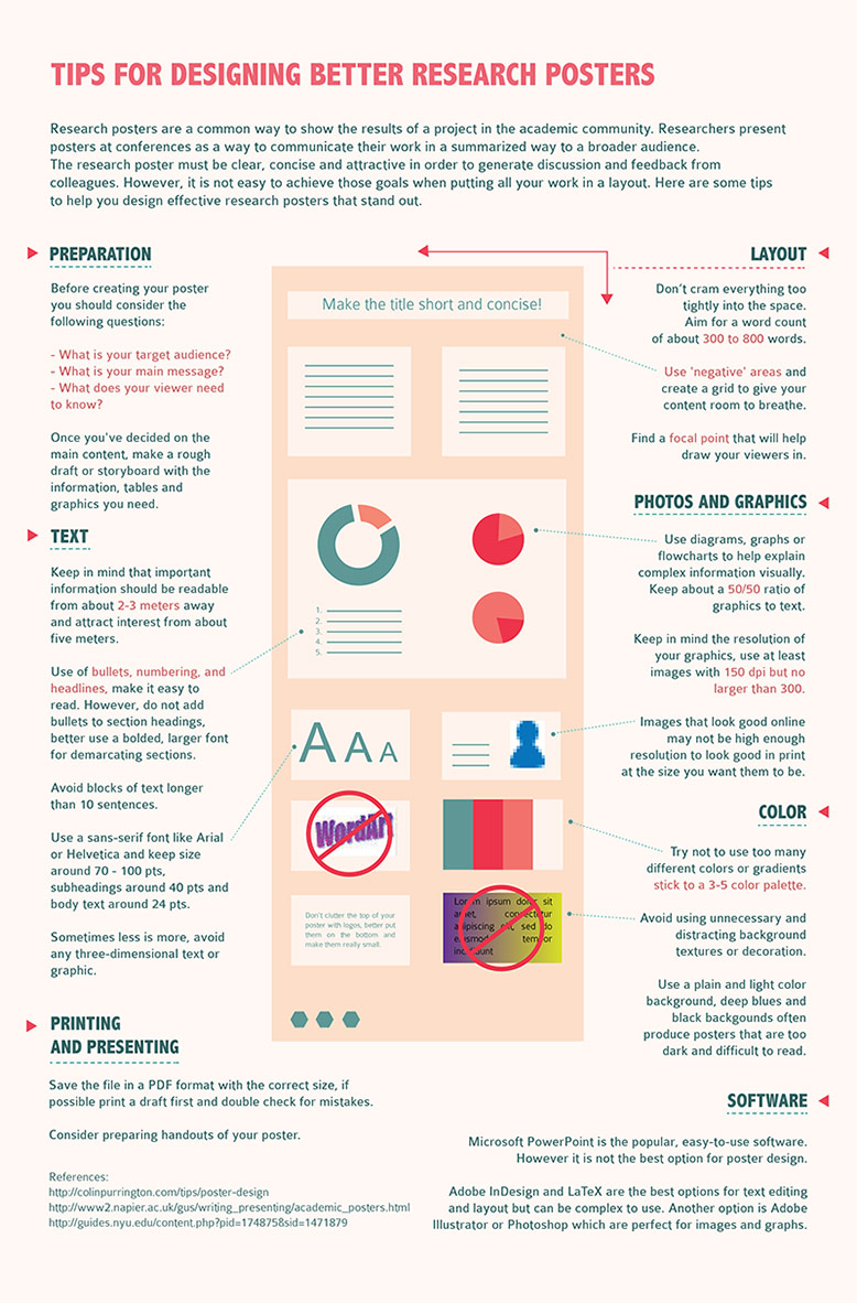
Avoid Clutter 📋
The most important part of designing the perfect poster is to not overcrowd it. That means that you should:
- Limit the poster presentation to a few main ideas/key findings
- Let the poster be snappy and attention grabbing by reducing the number of words and long sentences
- Leave around 40% of ”breathing space” around the text (no, we are not kidding!)
Have A Clear Title ✒️
The title should:
- Make it instantly clear what the project is about, and be results-oriented
- Be brief, catchy, interesting and not very long (one or two lines)
- Be written in bold with the largest font size to grab the reader’s attention
Keep The Lettering Simple 🔤
The lettering also affects how clear and easy the poster is to understand. You should:
- Use a maximum of three-four different font sizes (for the title, section titles and text)
- Avoid using to small fonts, as it should be readable from a distance of 2 – 3 meters
- Use plain fonts that are easy to read like Helvetica, Arial, Myriad Pro or Times New Roman (Comic Sans might make the poster look like an elementary school project)
Use A Plain Background 📄
A crazy background color or image can of course draw attention to the poster, but it can also make it almost impossible to read. Instead the background should:
- Be a photo or a color that is not to distracting (you should present your research, not your hobby photo project)
- Work together with ”breathing spaces” so that your project text becomes easier to understand
Use Colors To Enhance Meaning 🎨
By using colors correctly, you can enhance important parts and make the poster easy to read. You should:
- Have shades of a primary color (two or three)
- Use accent colors to highlight important elements
- Write the text in a couple of text colors
- Use color coding to guide the reader
Add Visual Interest To Your Poster 📷
Pictures, infographics and diagrams can be useful for displaying information at a glance and make the poster look more interesting. It can also enhance results and help guide the reader. It can be good to:
- Use a big recognisable image to grab attention (the image should of course be linked to the study)
- Make the poster more aesthetically pleasing and provide more information by using graphs, images and tables
Include Contact Information 📱
If you want the event attendees to connect with you and discuss your project (of course you want that!) don’t forget to include your contact information. You should add:
- Your email address (duh?!)
- Professional social media accounts like LinkedIn or Twitter (why not add a QR code?)
- A professional image of you (leave the cute selfies on Instagram!)